

Weyond
About Weyond
Weyond is a startup company committed to helping people learn new concepts through microlearning lessons on their phones called “Bites”. Instead of having to sign up for formal classes, Weyond offers concise material where users can learn while waiting for their bus or during lunch break. Weyond had mainly focused on gathering instructors to place their courses on their platform and wanted to gain more insight into the student experience.
My role was to provide user feedback through usability testing then provide design recommendations for the initial release of the Weyond app to students.
My Role
Deliverables
- Heuristic Analysis Audit
- Usability Test Report
- Usability Test Findings
- Design Recommendations
HEURISTIC ANALYSIS
Weyond had just received their first version of their app, the MVP, and wanted me to evaluate the app and give suggestions for improvement.
After exploring the app, I compiled my notes and prioritized the heuristic issues into a presentation. Here are some of my findings.
Help users recognize, diagnose and recover from errors
-
One of the crucial issues I found was password retrieval when signing into the account. There wasn’t a way to retrieve a forgotten or incorrect password.
-
This is highly necessary as this is a common issue with users. A way to avoid this issue is to have users stay signed in so they don’t have to log in for each session


USABILITY TEST REPORT
I created a usability test report so the stakeholders know what to expect and can give any feedback. I presented them with usability testing goals, the questions asked and how they will be conducted. Giving this report to the stakeholders provides for a clearer understanding and expectations.
Objective:
-
See if Weyond’s learning categories are easy to understand for users
-
Uncover usability errors on main red routes
-
Discover impressions about the look and feel
-
Gather any additional feature needs or suggestions


USABILITY TESTING
I spoke with 6 users remotely via Skype or Hangouts and asked them questions about the latest version of the mobile app. Each session ranged from 25-45 minutes and started with an introduction of myself and what to expect for this test session along with questions and tasks for the participant to complete.


One challenge I found was some participants were testing a more updated version of the app as Weyond released updates while I was testing. The findings differed from those participants as a result because the interface had changed. I was still able to test for important features and flows with some additional preparation of checking for any new updates before tests.
After the tests, I compiled my findings into a presentation to share with the stakeholders.


DESIGN RECOMMENDATIONS
After going over the usability testing findings, the stakeholders and I decided to focus on ways to help users find bites easier along with a way for users to learn more about Weyond. Based on their branding, I created the following mockups in Sketch.
-
Onboarding
-
Allow users to input their interests so they can be suggested more relevant material.
-
-
Search
-
When asking users to find other available courses, most users immediately looked for a search bar. They wanted to search for specific courses instead of clicking on categories or other means.
-
-
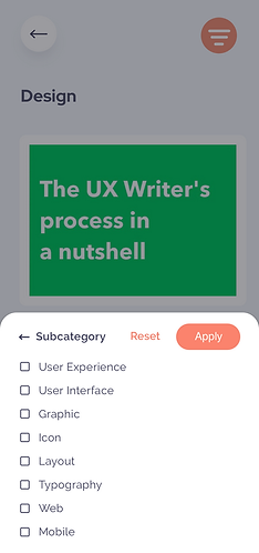
Filter
-
Users are presented with a feed of bites when clicking on a specific content category but are not given an option to further narrow down their options so I created a filter function to narrow down bites based on specific categories
-
-
About Weyond
-
Users want to feel connected with the company and giving them an option to learn more about Weyond while also showing how a bite works could be useful.
-
Onboarding
-
During usability testing, users mentioned how they’d want personalized bites based on their interests.
-
Since Weyond offers a variety of course content, this onboarding page during sign up will make users feel like their experience is personalized.
-
The user can be provided with more relevant content based on this input.


Search
-
After the user clicks the search bar, the user is presented with popular subjects or trending bites as an aid to the user's search.
-
Having the additional suggestions helps inspire users, provide more information on what's available and potential for Weyond to push for specific subjects or bites.


Filter
-
Users can narrow down the bites by subcategory, rating, and/or duration which allows the user to find material quicker.
-
Users can select all that apply by clicking on the checkboxes then clicking apply to filter the selection.
-
The full-page filter selection design allows for consistency with the clean minimal existing design throughout the app.


-
I created two different filter options as they both had their benefits but I ultimately recommended the first option as it is more consistent with their design which was very important to the stakeholders.
-
This second version has an overlay on the feed while displaying filter options from the bottom of the screen so users are more easily able to reach the categories with their thumb.

About Weyond
-
Based on usability testing, users wanted to connect and understand Weyond more so I suggested having an option for users to learn more about the company and its goals. This wasn’t a priority for the stakeholders but I wanted to make some recommendations due to the findings of users.
-
Also, from my research most European companies don’t include information about the company as they do in the United States and United States is one of their target regions so I proceeded with a couple of recommendations.


CONCLUSION
I learned how important communication is to ensure we’re both on the same page and understanding. Understanding the purpose and goals of the product design allows the designer to make the best product possible because it will be focused and aligned with stakeholder expectations. The stakeholders thoroughly enjoyed having a timeline, test plans and findings presentations to be aware of the process and share any thoughts or changes during the process.
I also learned how it is important to stay firm with some of your designs and reasonings if it’s backed up by user feedback so it keeps the product user-centered. At one point, the stakeholders wanted to deprioritize having a section about the company but I included this in my design recommendations as I felt it was expressed in the usability testing that it was important to them.